Design archive
I've never separated the words from the design.
I started my career in visual communications, and that experience shapes how I approach my work today. I've always believed that good design can make complicated information easier to understand. These are some of the projects that helped me develop that approach.
- 01
Internal communications · Walmart eCommerce
Tool Talk newsletter
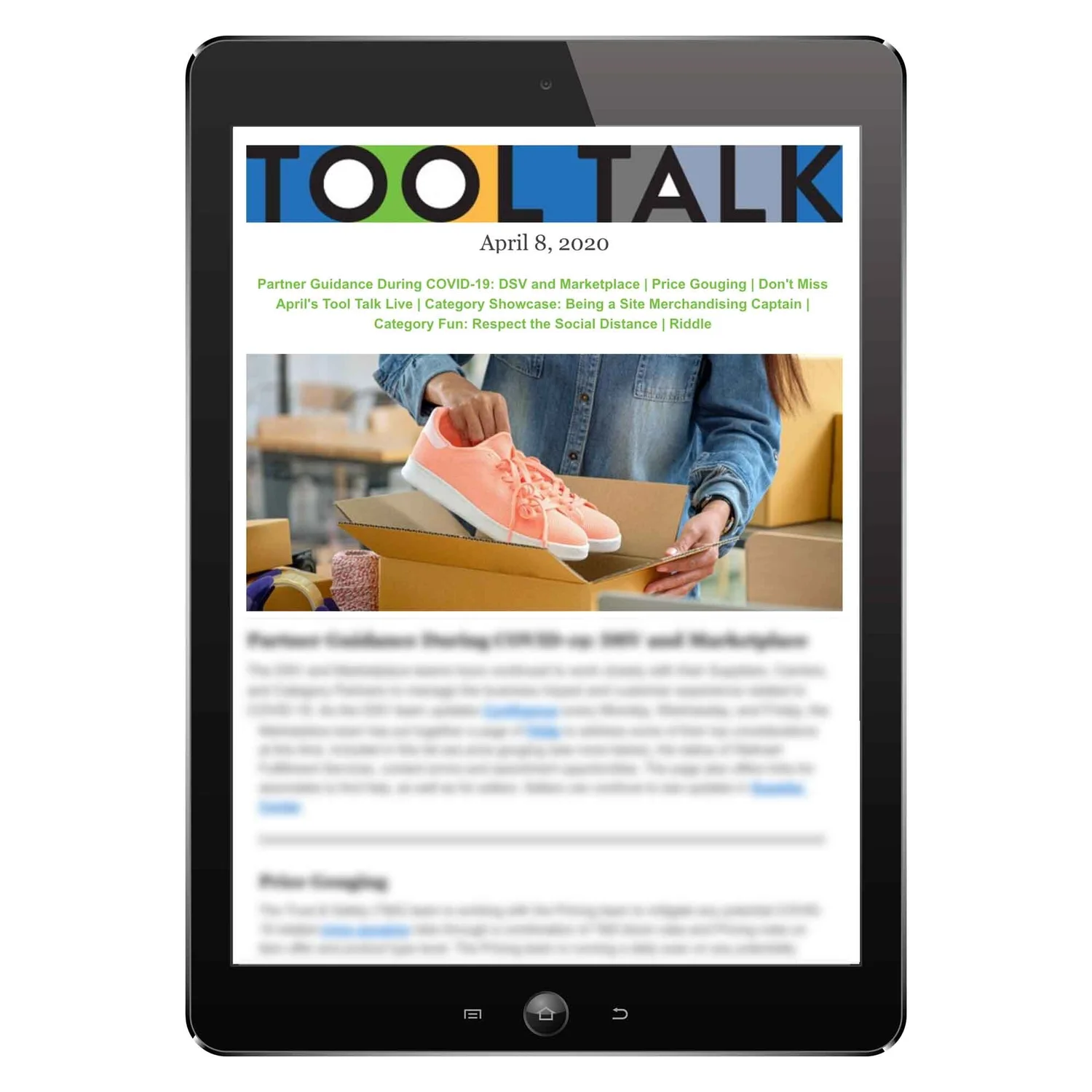
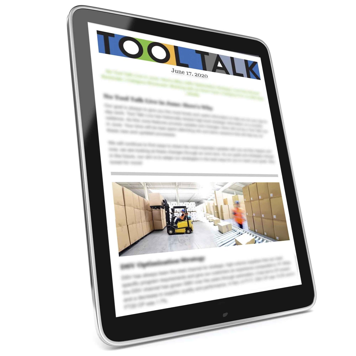
I redesigned Walmart's weekly Tool Talk newsletter for the e-merchandising organization, which relied on more than 40 tools to do its work.
The newsletter covered system updates, policy changes, and important operational information, including COVID-19 guidance. I introduced a linked table of contents so employees could quickly find what was relevant to them. I also added lighter content, including category showcases and riddles, to make the newsletter something employees wanted to read.
I created and owned Tool Talk Live, a companion series that gave employees another opportunity to learn about the tools they used and ask questions directly.
- 02
Stakeholder buy-in · Walmart eCommerce
IGNITE learning and development rebrand
Brand guidelines are my love language.
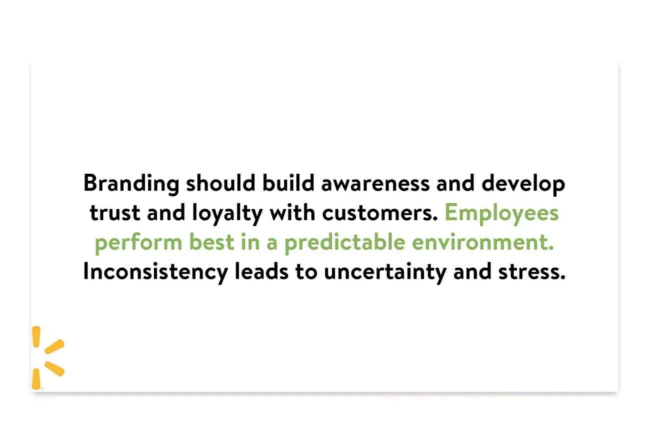
I created IGNITE for Walmart's internal learning and development team, developing everything from the name and tagline, “Spark Your Development,” to the visual identity and brand guidelines.
I wanted the brand to feel familiar to employees, so I used photography that reflected their actual work environments and developed a consistent visual system across the materials.
I also worked with stakeholders to explain the thinking behind the creative decisions and build support for the new identity.

- 03
Employee enablement · Walmart eCommerce
MBTI participant guide
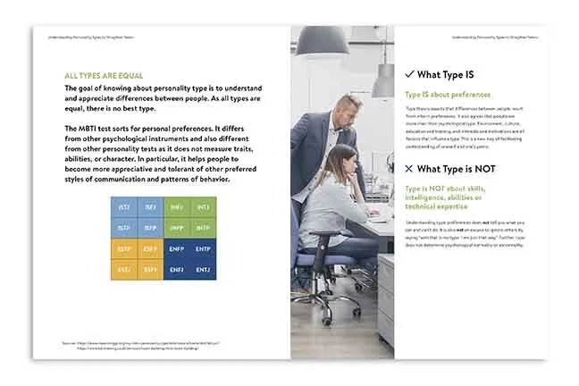
I designed a participant guide for MBTI workshops with new merchant hires at Walmart, using the visual identity I'd created for IGNITE.
The guide included information about personality types, discussion exercises, and an action plan employees could complete during the session.
I organized the content to make it easy to follow and included a section explaining what MBTI measures and what it doesn't. The guide also gave participants space to reflect on their results and think about how they could use what they learned when working with their managers and colleagues.

- 04
Complex information · FICO
Products and solutions book
I designed a 138-page reference book covering FICO's product portfolio, organized by industry and updated annually.
Working within FICO's existing brand guidelines, I created a consistent layout and visual hierarchy to make a large amount of detailed product information easier to navigate.
I also incorporated relevant facts and statistics throughout the book to help the sales team find useful information quickly and discover details they might not have known to look for.

- 05
Measurable outcome · Oracle
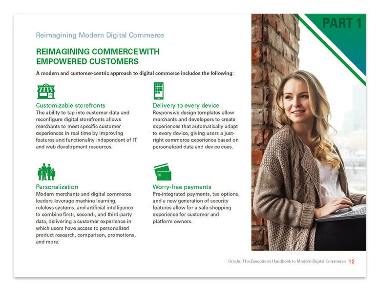
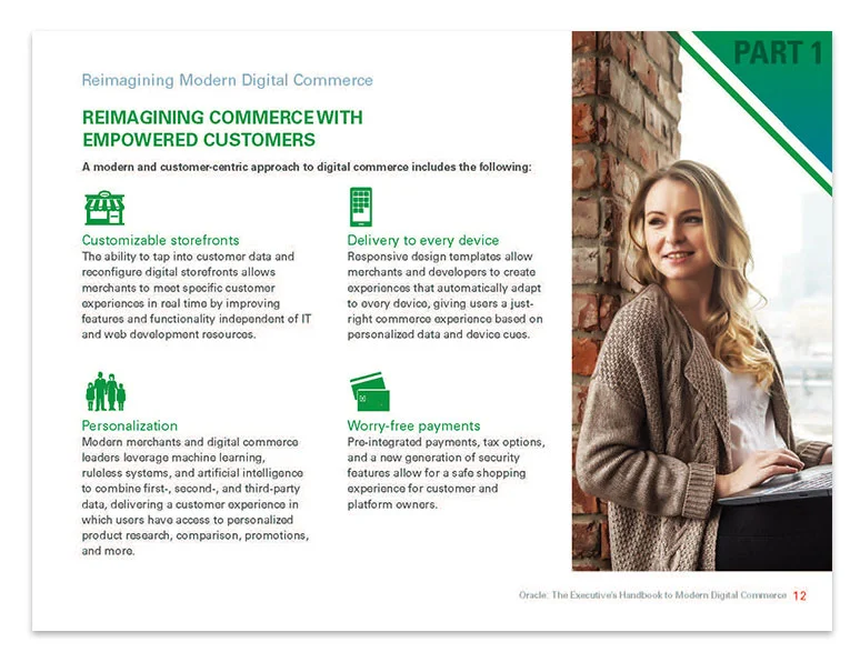
The Executive's Handbook to Modern Digital Commerce
I developed a long-form executive handbook for Oracle that brought together industry research, statistics, and insights from an outside analyst.
The goal was to give business leaders a useful resource for understanding modern digital commerce. I organized the content into clear sections and created a consistent visual system that made the material easy to navigate.
The handbook achieved a 15% conversion rate against a goal of 5%.

- 06
Multi-channel campaign · The Bay Club
Augie's Quest campaign
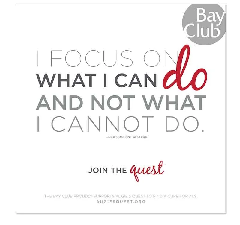
I developed the concept and design for The Bay Club's campaign supporting Augie's Quest, an ALS research foundation.
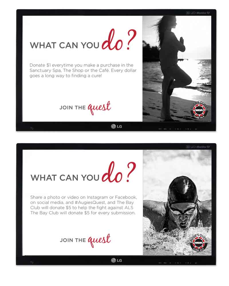
The campaign was inspired by a quote from Augie Nieto, “I focus on what I can do and not what I cannot do.” I used that idea to ask members a simple question. “What can you do?”
From there, I developed creative across print, digital signage, web, social media, and apparel, with different ways for members to participate. Someone could donate a dollar at the club, share a post, or make a larger contribution.
The campaign raised $100,000 in six weeks.
My full design archive, including print, digital, and presentation work for Oracle, FICO, Stitch Fix, Travelzoo, and others, lives at susiedeckerdesign.com.
View the design archive